HARBOUR HOUSE
BEHIND THE WORK
DESIGN JOURNEY
Design concepts, briefs and development

JUMP AHEAD
BRAND CONCEPT
A Harbour House origin story
A childhood in Sai Kung
I spent most of my childhood in Sai Kung, a small village in Hong Kong that was once a Cantonese fishing village, but has long since been into a melting pot of local and Western culture.
Some of my fondest memories include beach trips with family, hiking through the surrounding mountains, and wandering narrow alleyways lined with colourful post boxes and stores full of after-school treats.
The sense of community was unforgettable: children running between houses, neighbourhood events, street parties, and even the buzz of trick-or-treaters queuing outside our door on Halloween (it went wild!).


What I loved most
Evenings in small, family-run restaurants, where conversations flowed between tables and the sense of community felt effortless and genuine.


A new era
At the same time, a growing wave of day-trip visitors has reshaped the local economy. Many come specifically to visit well-known Instagram-able cafes such as 'Little Cove', whose photogenic branding and social media presence turned it into a destination in its own right.
As businesses respond to this audience, much of the town's visual landscape has shifted in the same direction.
Sai Kung today is a thriving hotspot, but much of the community-driven atmosphere that made it special has been lost. With so many new businesses designed primarily for visitors, I began to wonder how design could appeal to a new market while rebuilding familiarity and belonging for the local community.
My response:
Thus, Harbour House was born. My vision was to create a restaurant brand that bridges the gap between the old and new- respecting the town's heritage while appealing to a growing audience, offering a space for everyone under one roof, or one "House", so to speak.
After extensive personal research, I developed a solid restaurant brand concept, which I outline below. This concept directly informed the design question and brief, guiding my visual exploration and the development of deliverables for this project.
My return to town
When I returned last year, I was struck by how much had changed. Many of the long-standing local businesses I remembered had been replaced with sleek new cafes, pizza restaurants and stores- all modern and 'Instagram-friendly'.
COVID had caused numerous closures, and many long-time residents had left, significantly altering the village's demographic. While new residents have moved in, the sense of community that defined the town has yet to be rebuilt.

Screenshot from Little Cove's Instagram
BRAND OUTLINE
Harbour House- The new heart of the Sai Kung community
Brand Premise - A place for everyone
Harbour House is a casual, family-friendly restaurant on the harbourfront in Sai Kung, Hong Kong. Inspired by the town's cultural heritage, the concept aims to strengthen a sense of community and become the heart of the neighbourhood.
Envisioned as a welcoming 'house by the water', Harbour House is designed as a place to connect- with spaces to dine, lounge, chat, and play. Everyone has a space here: whether it's a dog owner stopping for a morning coffee overlooking the sea, a tourist seeking a picturesque lunch destination, or a local family gathering for an evening dinner filled with music, conversation, and games among friends and neighbours.
Overview
Type: Casual, family-friendly harbourfront restaurant
Location: Sai Kung, Hong Kong - waterfront near ferry departures and bus/taxi depot
Mission: Bridge the old and new while fostering community connection
Brand personality: Friendly, relaxed, inclusive, playful, coastal
Target Audience
Primary
-
Local families and residents
-
Day-trip tourists visiting Sai Kung
Secondary
-
Students from nearby international schools
-
Couples, small groups, solo visitors
Visitors often discover Sai Kung destinations through social media, while locals value familiarity and community-driven spaces.
Key Insight

Brand Direction
The Harbour House identity should balance heritage and contemporary appeal. Inspired by Sai Kung's culture and street life, the visual language draws from coastal textures, fishing village and Cantonese iconography, and relaxed harbourfront atmospheres to crreate a welcoming yet distinctive destination.
Using this brand outline as a foundation, I developed a design question and brief to guide the visual identity of Harbour House.

DESIGN QUESTION
How can a restaurant brand visually communicate the feeling of an open, welcoming Harbour House- a place where tourists and locals naturally gather?
DESIGN BRIEF
Brand identity design brief for Harbour House
Design Challenge
How can our restaurant brand visually communicate the feeling of an open, welcoming place where tourists and locals naturally gather?
Objective
Develop a visual identity system for 'Harbour House', a community-focused restaurant that celebrates Sai Kung's cultural heritage while appealing to a modern audience.
The identity should balance warmth and authenticity with a contemporary coastal aesthetic, creating a distinctive harbourfront destination.
Visual Direction
The brand should feel:
-
Warm and welcoming
-
Playful and community-driven
-
Rooted in the town's culture and heritage
-
Contemporary enough to resonate with modern visitors
Visual inspiration may be drawn from the town's environment and cultural landscape, including coastal textures, harbour movement, and local visual traditions.
Deliverables
A cohesive identity system including:
-
Logo system (primary and variations)
-
Brand elements - colour palette, typography, patterns
-
Website - branded landing page concept
-
Social media - campaign concept and visual presence
-
Print - menus, signage, and in-restaurant materials
The identity system should be available in a downloadable brand kit / presentation.
The following section begins to respond to this brief, exploring visual research and creative development that shaped the Harbour House identity system.
RESEARCH AND IDEATION
Responding to the design brief
Observation of Sai Kung's cultural and environmental visual elements
To identity key visual themes, I drew visual inspiration from elements around the town, like red lamps and ocean waves.
From here, I was able to create playful visual assets that immediately linked to the local culture.


Patterns & textures:
To communicate the history of the village in a reimagined design, I implemented textures from posters, iconic Hong Kong bamboo scaffolding, and other found objects to inspire brand visuals. Patterns were inspired by iconic Hong Kong stripes, a famous ice cream van local to the area, and other meaningful visual elements.
I particularly drew inspiration from the feeling these found textures and patterns embodied- a feeling of a well loved and worn community, with many memories. Something full of history and clutter. This directed me to explore patterns that focused on detailed, busy designs, hand-drawn styles that reflected small-town, personal tones, and rough, old textures to reflect age and history.

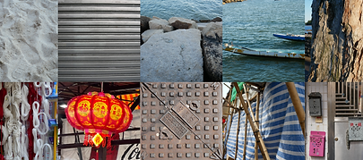

Visual observation of local businesses
Many new restaurants in the area lean into minimal, Instagram-friendly aesthetics, often avoiding colour.
Whilst this may make it easier for the brand to look appealing on socials, I know that there are other ways to design a beautiful brand.
So instead, I explored more vibrant colours, finding inspiration from long-standing local businesses to reflect the playful, family-oriented community brand.
Through experimentation with values contrasts (darks vs. lights, pastel vs. neon), I developed a palette that feels dynamic yet grounded.
Colour palette design
Main Palette
Vibrant red - Similar to traditional signage and postboxes
Ocean blue - Drawing from Sai Kung's surrounding nature
Cement grey - Echoing many of the walls that make up the town
Pale yellow - A nod to the luminescent lights of the wet market
Secondary Palette
Deep red, blue and grey- Complementary colours in darker hues
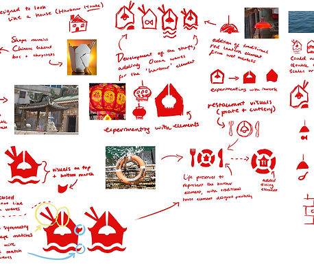
Turning observations into brand elements
With all of my gathered visuals, I began to draw from the elements I highlighted earlier in my process to design a logo. This included the red lanterns from the wet market, visuals of the ocean waves, boats, Chinese traditional utensils and more.
I began to develop these rough ideas, adding in colour experimentation. This helped me visualise the design from another perspective and helped me to refine the logo ideas, leading to the production of my final 2 options.


FURTHER DEVELOPMENT
Refining visual ideas into complete brand assets
Logo Development
To identity key visual themes, I drew visual inspiration from elements around the town, like red lamps and ocean waves.
From here, I was able to create playful visual assets that immediately linked to the local culture.
DESIGN ECOSYSTEM
Final project deliverables


